

In this feature, UTM Lecturer Mr. Ford Lei discusses the use of free interactive data visualisation platform Tableau Public to transform raw data into insights with practical applications
As one of the most popular, online-based, visual analytics platforms, Tableau Public makes possible the visualisation of raw data by individuals and corporations. Students and researchers in the tourism field should take advantage of tourist-data visualisation techniques to gain a deeper understanding of various tourist markets.
This Tableau Public project visualises a dataset from the Macao Statistics and Census Service (DSEC) in order to illustrate data on visitors coming from different regions of Mainland China to Macao between 2011 and 2022.
Why this dataset and why is it important?
There is a need for Macao’s tourism sector to have easy access to this dataset, as tourists from Mainland China make up the largest portion of the visitor market. A more detailed understanding of this segment might be gained by looking at data on tourists from the various regions within Mainland China.
Reasons for using different kinds of graphs to visualise the data.
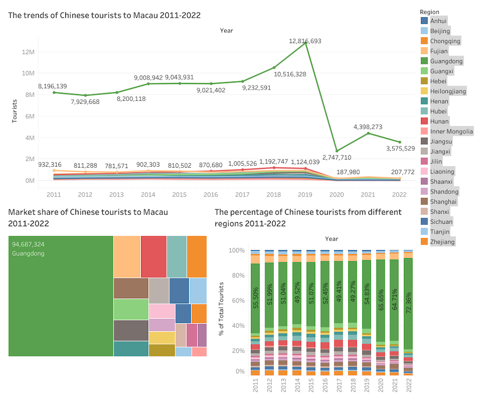
First, I used a line chart to visualise a time series dataset so that I could easily see the trend of tourists from different regions each year (see Figure 1). The purpose of this visualisation is to allow me to compare data on different regions in a time series or examine the performance of each region on its own.
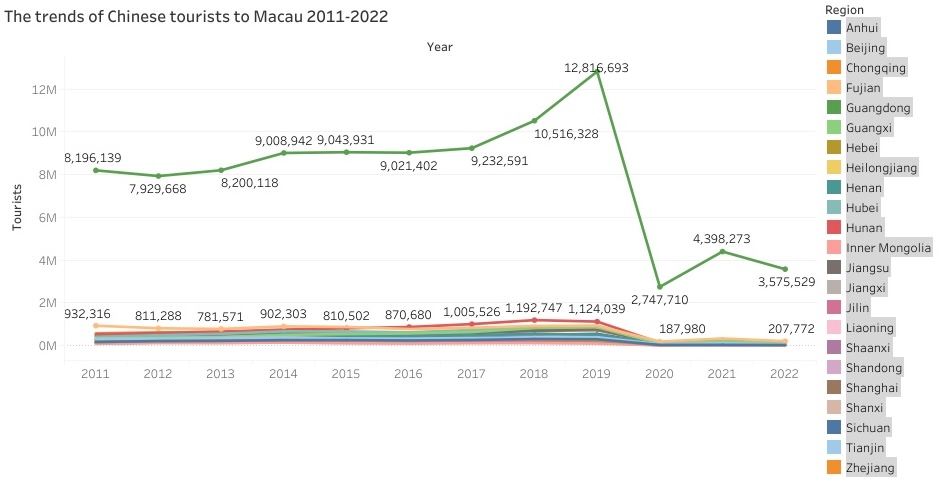
Figure 1. Line chart
Data source: Macao Statistics and Census Service (DSEC)
As a second step, I used a bar chart to visualise the weighting of different regions within the Mainland China segment in a series of different years, based on the percentages for each region (see Figure 2). Using this example, I am able to see the percentage of tourists visiting Macao from different regions of Mainland China in a given year.
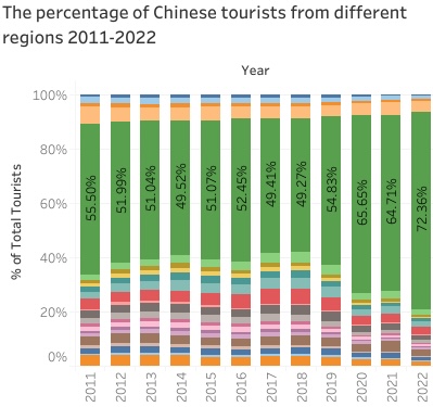
Figure 2. Bar chart
Data source: Macao Statistics and Census Service (DSEC)
Lastly, I have plotted the distribution of the total number of tourists from different Mainland China regions from 2011 to 2022 in the table graphic below (see Figure 3). Here, I can see at a glance the market share of each region and compare it with the total number of tourists, within the 12-year period ended 2022.
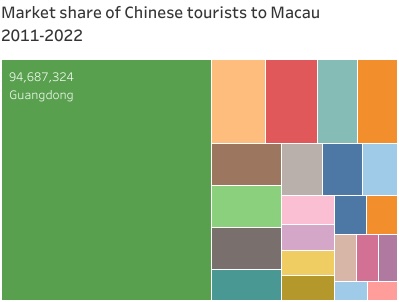
Figure 3. Table graphic
Data source: Macao Statistics and Census Service (DSEC)
To conclude, in order to visualise the data of visitors coming from different regions of Mainland China to Macao between 2011 and 2022, I have used three types of graphs. With the assistance of Tableau Public, we are able to see the trends of tourists coming from different regions each year. Additionally, we can see how many tourists visit Macao from different regions each year and the percentage of each region’s market share in Macao.
By UTM Lecturer Mr. Ford Lei Chong Fo, Faculty of Creative Tourism and Intelligent Technologies


攻讀酒店管理學士學位-74x55.jpeg)
